Joel Paolo
Product Designer
Sole Product Designer
Mar - Nov 2025
Web, iOS, Android
Figma, Webflow, Bolt, Datadog

Streamlining workflows through user-centered research and intelligent information architecture

To uncover the varied needs of different user types, I conducted comprehensive research including:
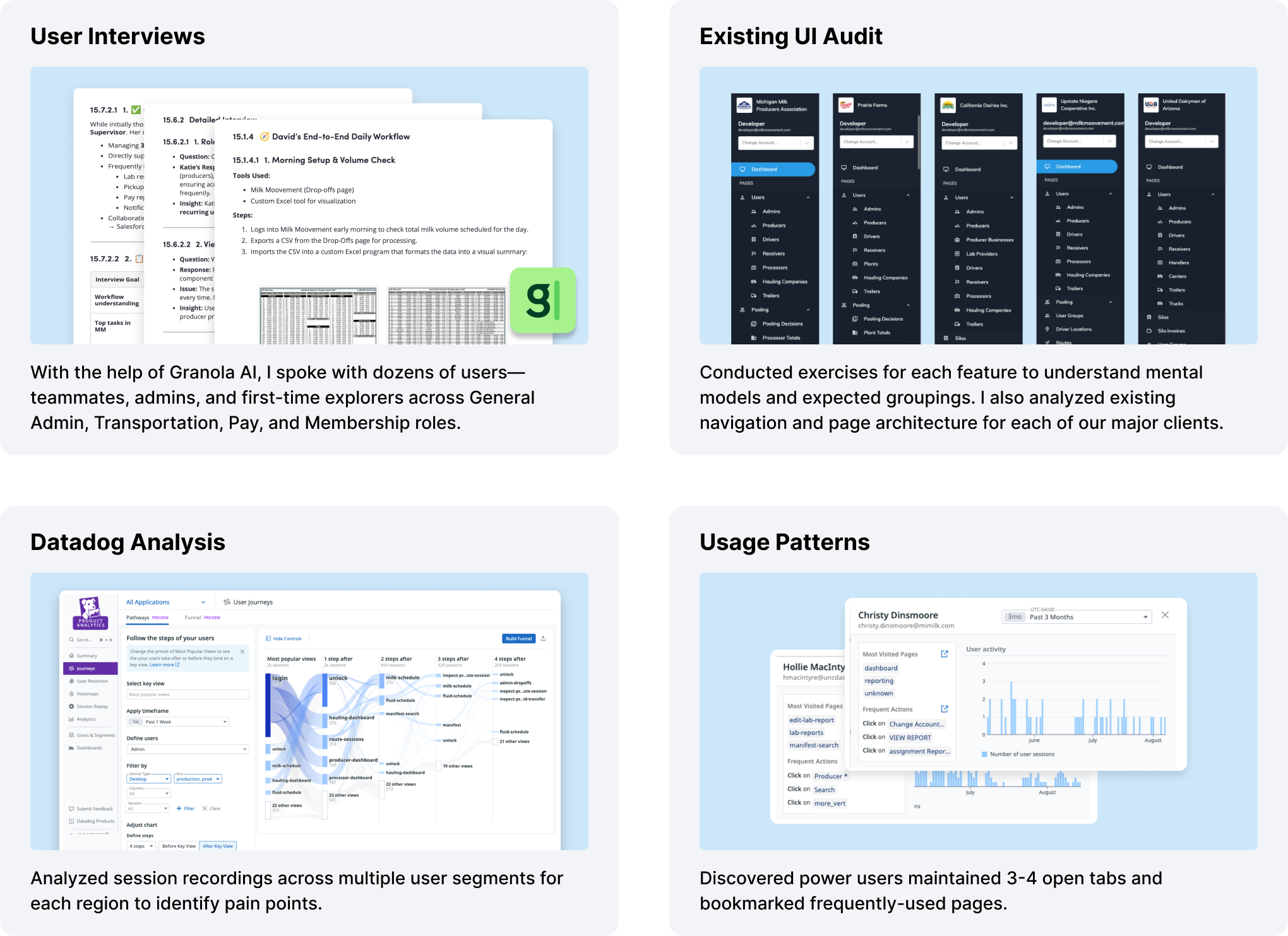
💡 Users were often lost and spent significant cognitive load searching for pages
💡 Power users resorted to bookmarking pages or keeping multiple tabs open
💡 Terminology and sorting inconsistencies existed across all regions
💡 Each user type had specific pages they worked on and didn't want to see irrelevant sections
I redesigned the navigation to improve usability, clarity, and scalability while maintaining all user permissions. The new structure surfaces essential features immediately and reduces clutter through a clear hierarchy that balances simplicity with flexibility. Frequently used features appear at the top level, while secondary options are revealed contextually to minimize cognitive load.
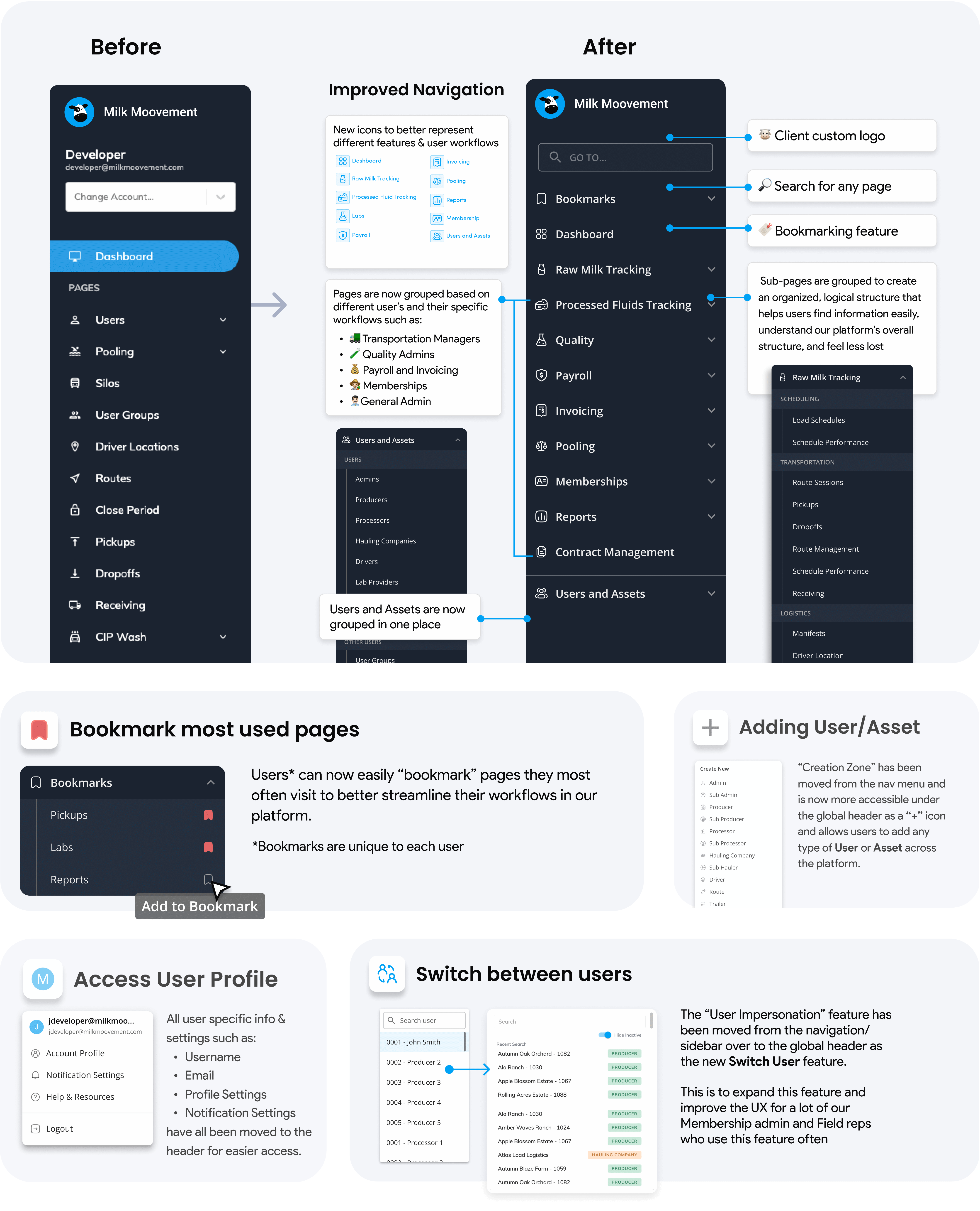
I refined labeling, implemented consistent UI patterns (collapsible menus, icons with text, search, and sticky navigation), and added dividers between sections for better readability. The design scales to accommodate future client-specific categories without disrupting the user experience, and all security permissions remain intact. I also updated the Permissions page to align with the new navigation structure.


Making complex data clearer and more accessible without expensive custom development
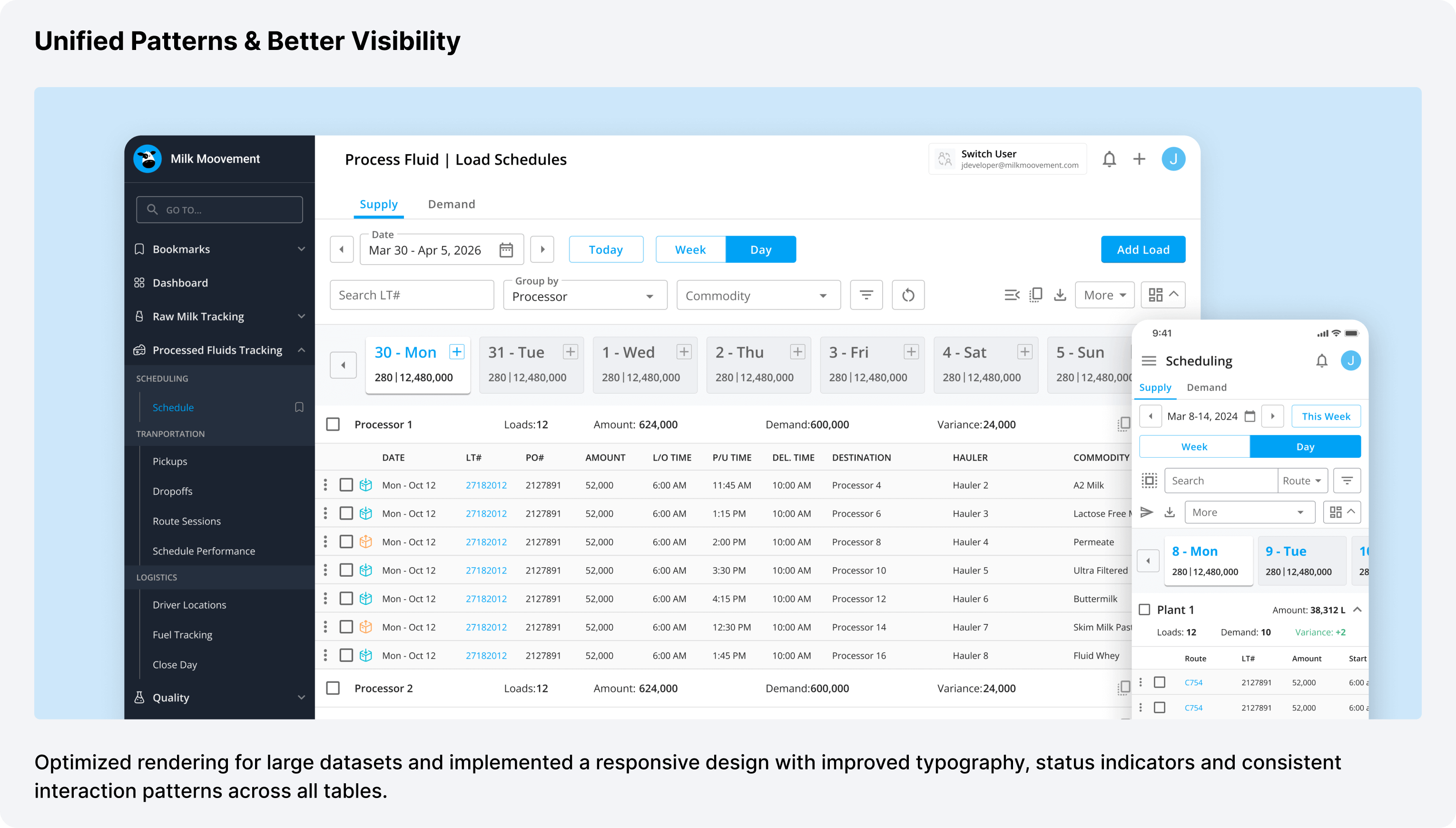
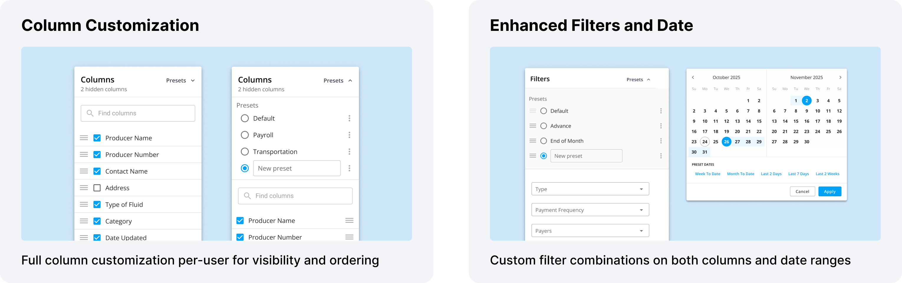
These table enhancements became part of our broader design system, ensuring consistency across Platform, Transportation, Pay, and Membership modules. Every new feature could leverage these patterns, accelerating development while maintaining quality.


The navigation research revealed who our users were. The table work gave me the patterns. Now it was time to meet them where they actually work—in trucks, on loading docks, and in the farms.
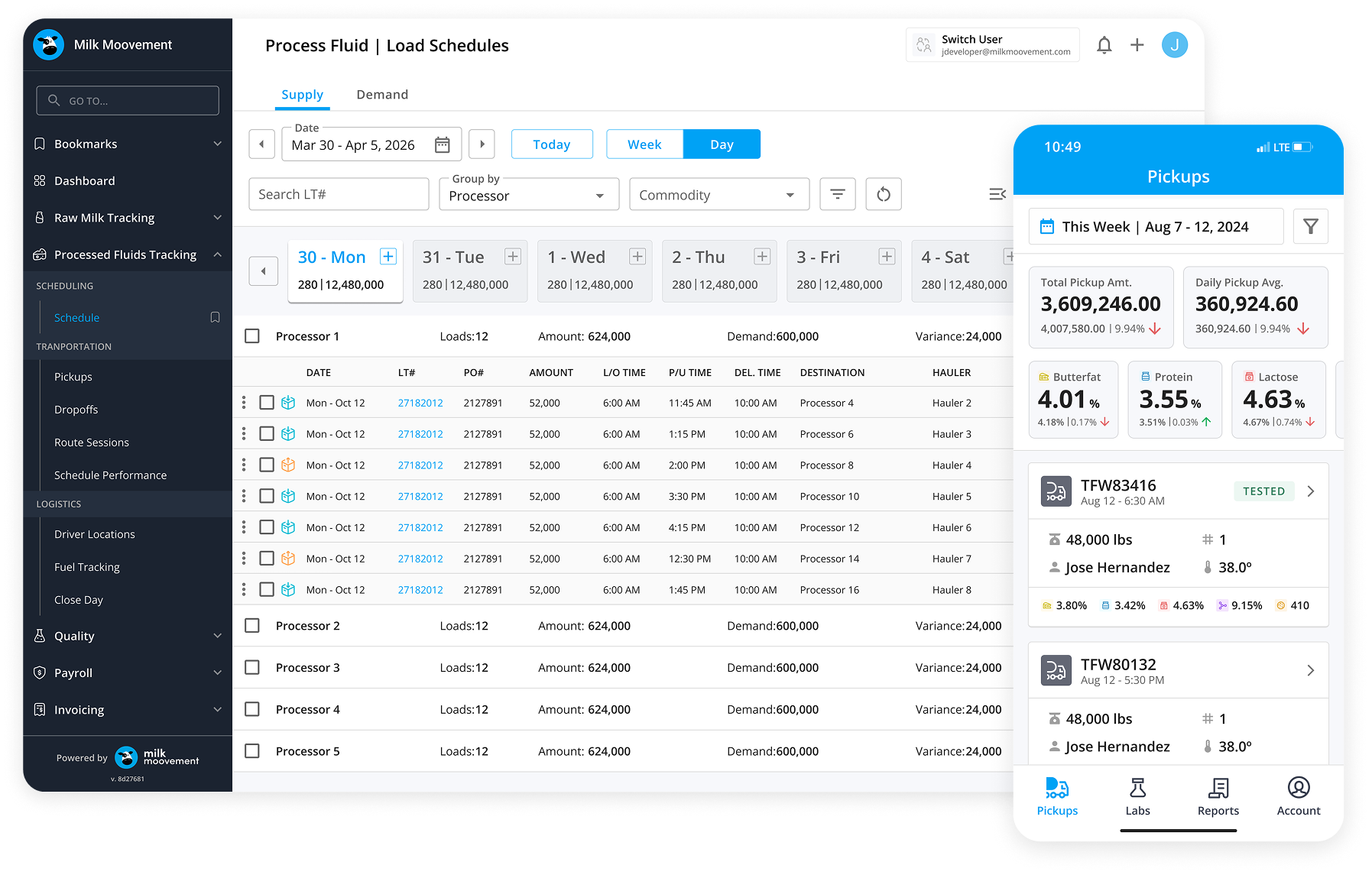
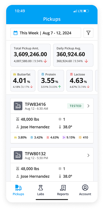
Dairy operations happen in the field—drivers picking up milk from farms, plant receivers managing incoming loads, and producers tracking their operations. These users needed mobile-first experiences designed for their specific workflows and environments.
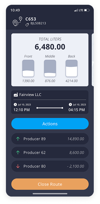

Designed for truck drivers collecting milk from farms and delivering to processing plants.
Turn-by-turn navigation optimized for milk hauling schedules
Streamlined process for recording tank info, temperatures, and samples
Critical for rural areas with poor connectivity
Quick capture of seals, samples, and load conditions
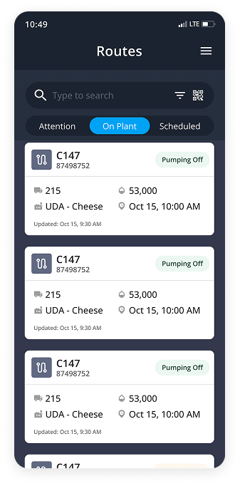

Designed for plant staff managing incoming milk loads and quality testing.
Real-time visibility of incoming loads and their status
Guided process for testing milk and recording results
Special workflow for non-member supplier milk
Track which silos receive which loads
Quickly find loads by status, supplier, or handler

Designed for dairy farmers to track their pickups, lab results, and pay reports.
At-a-glance view of pickup trends, quality metrics, weather
Streamlined process for recording tank info, temperatures, and samples
Easy access to quality testing data and trends
Monthly statements and historical payment data
Update contact info, milking hours, tank details
These mobile solutions transformed how thousands of users perform their dairy tasks daily and is crucial to their success.

The most valuable insight from this project was learning how deeply different each user type's workflow was. Transportation managers, quality administrators, payroll processors, and membership coordinators all approached the platform with completely different mental models and goals.
By conducting card sorting exercises, analyzing session recordings, and speaking directly with users across different regions, I was able to move beyond assumptions and design navigation that truly matched how people worked. The bookmark feature, for instance, came directly from observing power users keeping multiple tabs open—instead of fighting that behavior, I designed for it.
As the sole designer supporting multiple product lanes, I had to work closely with different engineering teams working on Platform, Transportation, Pay, and Membership features. The key was establishing clear design systems and documentation that teams could reference independently, while maintaining regular sync points to align on larger initiatives.
Presenting user research data became crucial for getting buy-in. When I showed engineers Datadog recordings of users struggling to find features, or presented card sorting results that contradicted our current information architecture, it created shared understanding and urgency. Data-driven design decisions moved faster than opinion-based ones.
Working across web platform, driver app, receiver app, and producer app taught me the value of systematic thinking. Rather than designing each interface in isolation, I established core patterns—navigation structures, form patterns, table designs, status indicators—that could adapt across contexts while maintaining consistency.
This unified approach made the platform feel cohesive even as users moved between different modules or platforms. A driver who used the mobile app could more easily understand the web platform when needed, and vice versa. It also accelerated design and development velocity—once we had solid patterns, new features could be designed and built faster.

.png)