
Joel Paolo
Product Designer
UI/UX Designer
Apr - Oct 2017
Web
Sketch, Invision, Zeplin, Webflow
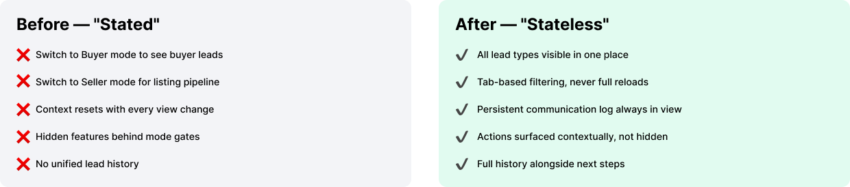
Keller Williams' Team Leads CRM had the right users — nearly 8,000 real estate agents relying on it daily — but the wrong design. The product had been sold to a broad audience it wasn't architected to serve, and the cracks showed everywhere: inconsistent UI, buried features, and a fundamental structural flaw called "States" that forced users to manually switch interfaces depending on whether they were working Buyers, Sellers, Aftercare leads, or Lenders.
Every context switch broke the agent's flow. For a profession where momentum with a client is everything, this wasn't just a UX inconvenience — it was a reason not to use the platform at all.
I came into this project having zero background in real estate. Rather than treating that as a liability, I leaned in — immersing myself in Keller Williams' training materials, reading their agent handbook cover to cover, and sitting with a top-producing broker to understand how agents actually think about their pipeline. You can't design for a mental model you don't understand.
"Users spend 90% of their time on a single page — and they were actively avoiding it."
— Lead Management Pain Point Discovery
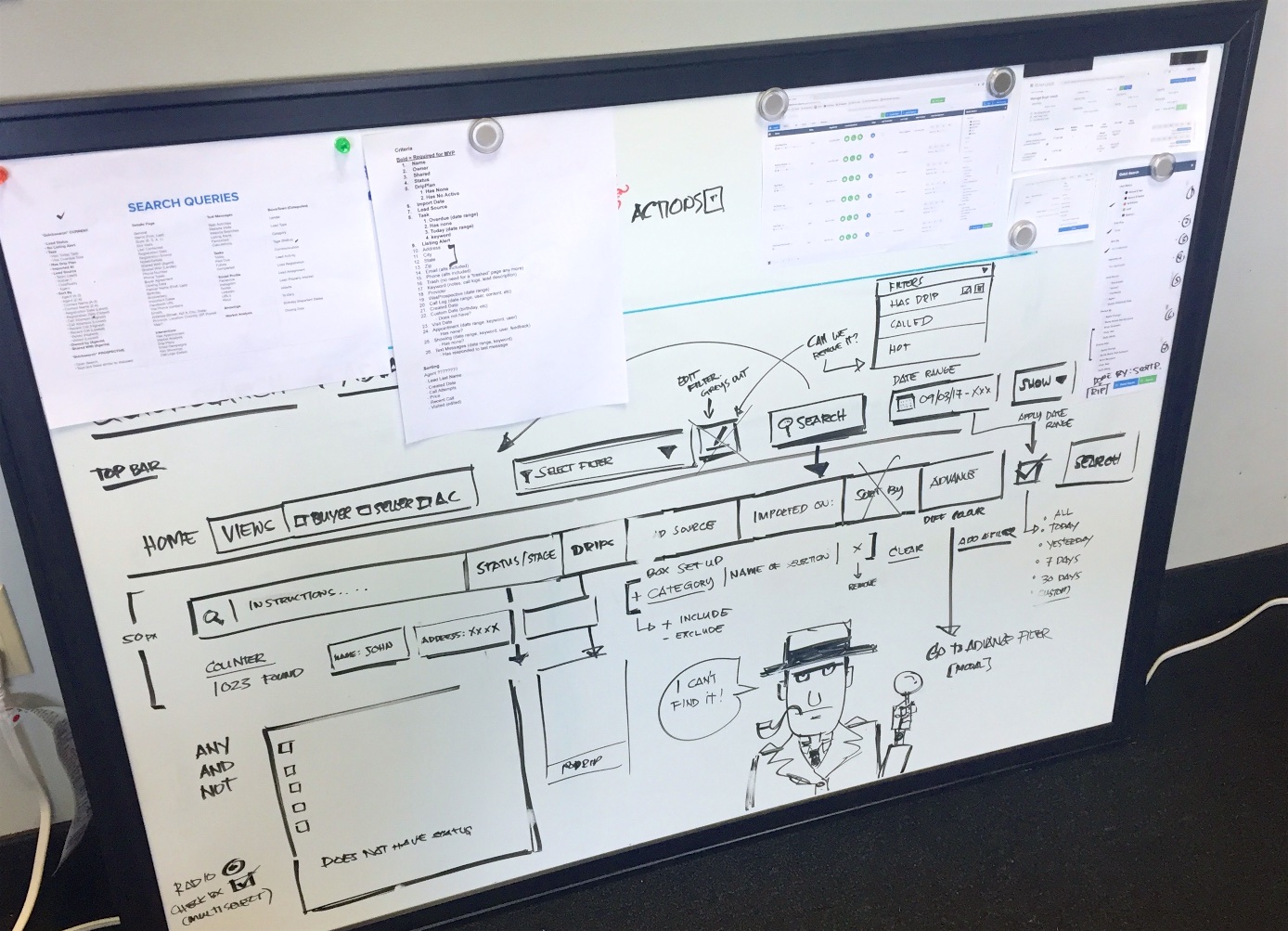
Research happened on three fronts simultaneously. First, I ran user surveys through the platform and conducted phone interviews with high-volume agents — the power users who'd expose both the platform's strengths and its deepest frustrations. I paired this with heat-mapping and Google Analytics to build a factual picture of how the platform was actually being navigated, not just how we assumed it was.

.jpeg)
Second, I embedded with the support and training teams. These were the people fielding daily tickets, running onboarding calls, and hearing every complaint first-hand. Their institutional knowledge was invaluable — it surfaced patterns no survey would catch.
Third, I conducted a structured competitor analysis to benchmark what users would expect from any CRM, separate from what would make Team Leads genuinely differentiated.

After hundreds of hours of whiteboarding, user flow mapping, and iteration with our product manager, we landed on a north star concept we called Stateless.
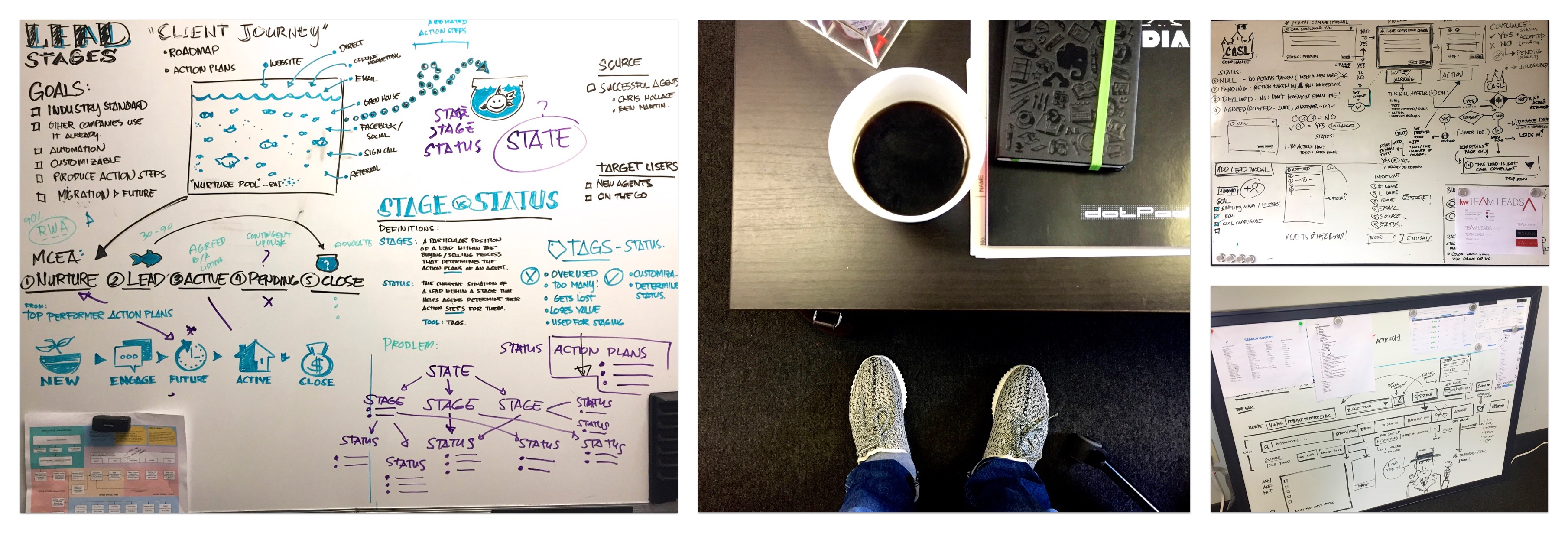
The old platform forced agents to declare their context — Buyer, Seller, Aftercare, Lender — before they could access the right interface. This fragmented their workflow constantly. Stateless eliminated that entirely: one unified experience where every agent type could operate without ever switching modes.
It sounds simple. Getting there required rethinking the information architecture from the ground up — restructuring how data was displayed, what actions were surfaced, and how communication history was woven into the same view as future tasks.

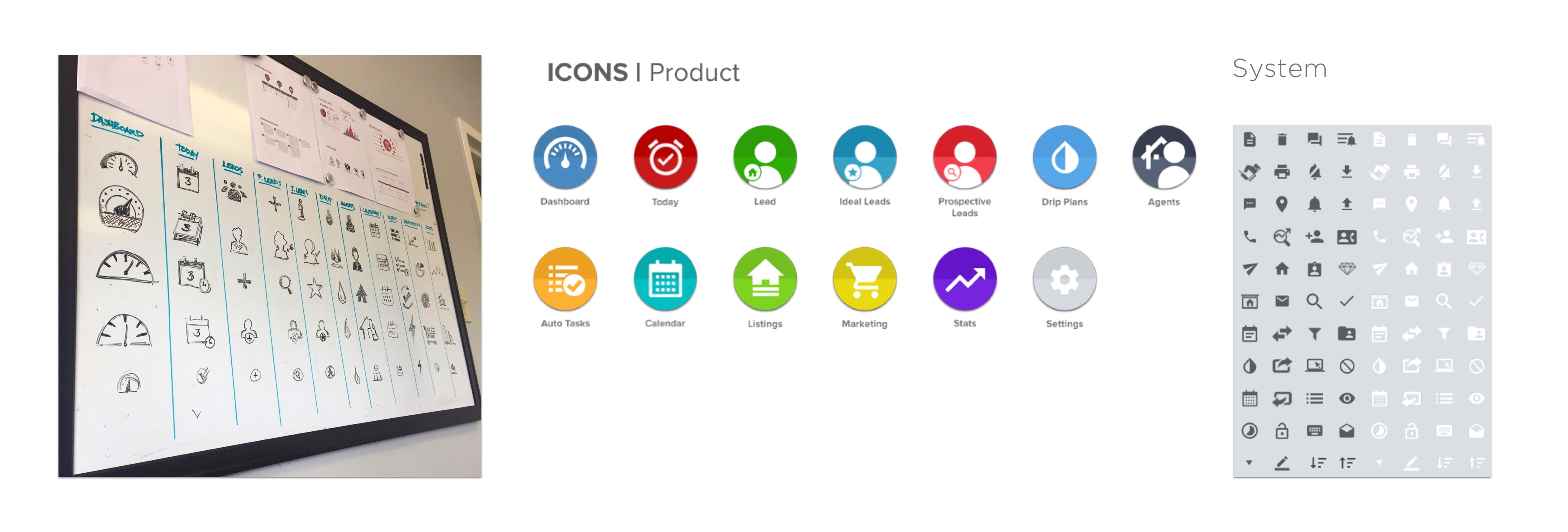
Rather than inventing a new visual language from scratch, I made a deliberate choice: adopt Google's Material Design as the foundational system. Our users — busy real estate professionals — were already fluent in it across Gmail, Google Calendar, and Drive. Reducing cognitive friction meant building on familiarity.

Material gave us tangible surfaces, print-like hierarchy, meaningful motion, and adaptive layout rules. I extended it with a custom component library — modals, tables, buttons, form states — all documented in a formal Design Style Guide delivered to the dev team via Zeplin. This unified implementation across design and engineering, cutting back-and-forth significantly.
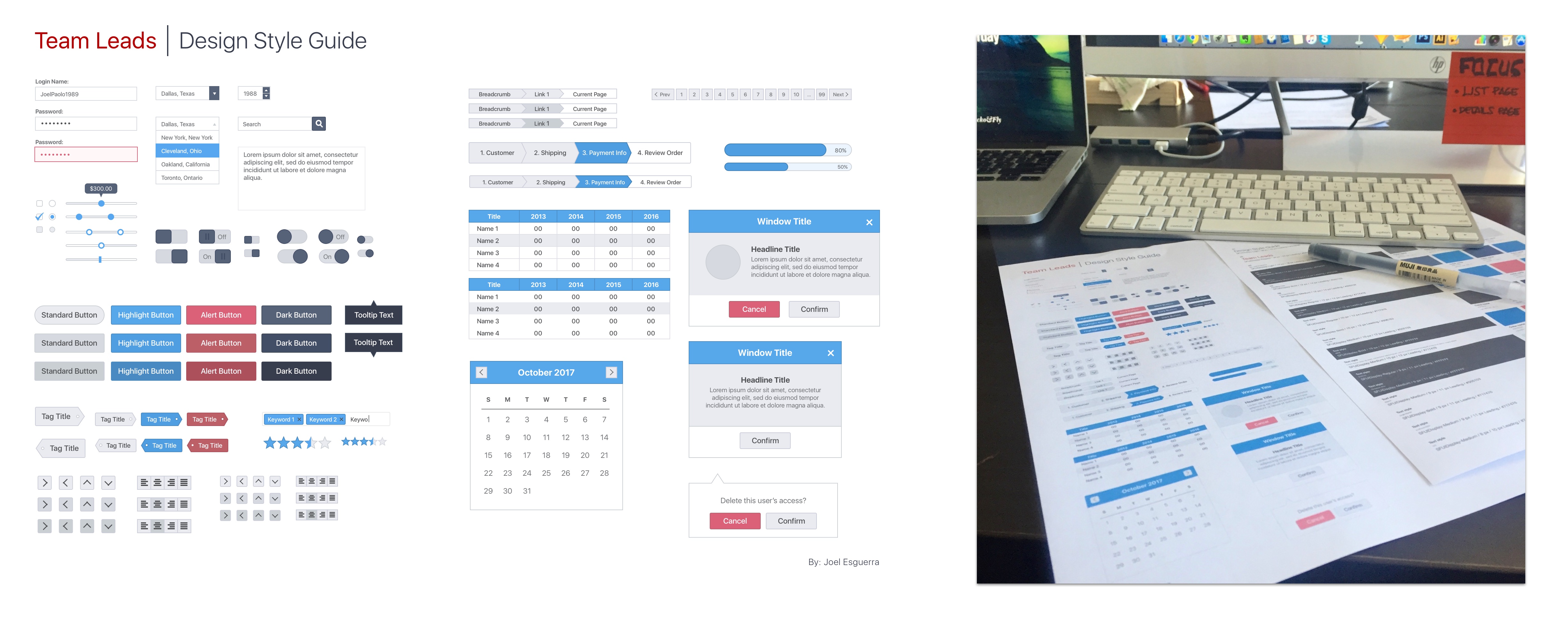
Iconography was rebuilt entirely: custom product icons for primary navigation, Google's system icons for utility actions. Consistency at this level might seem invisible to users — but its absence is what caused the original platform to feel broken.
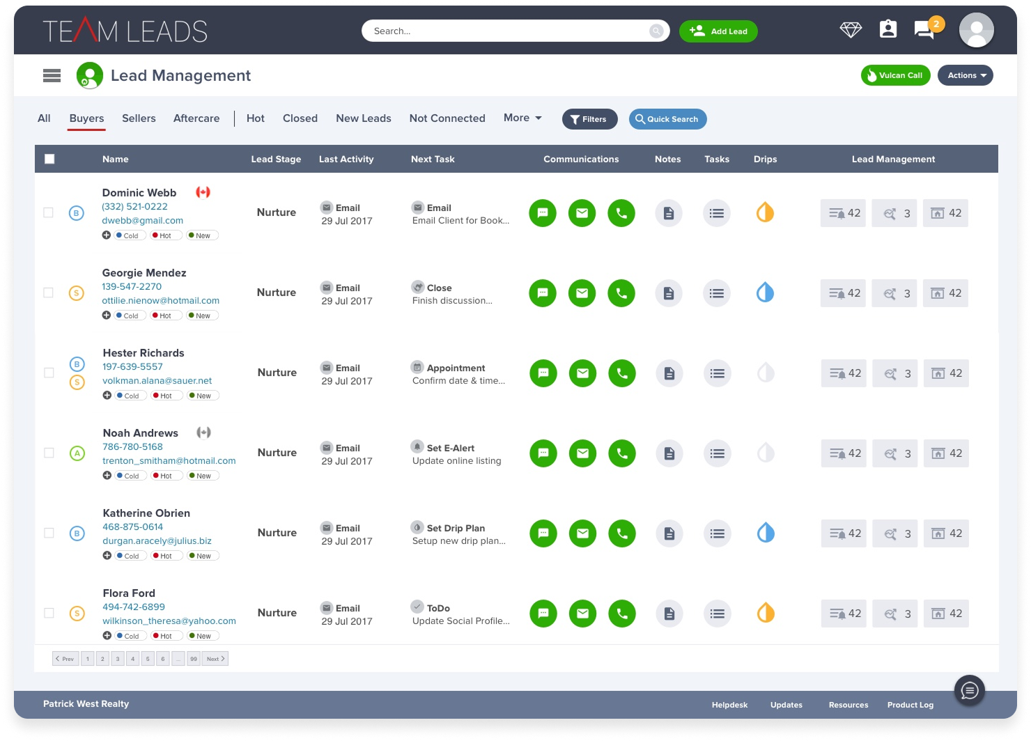
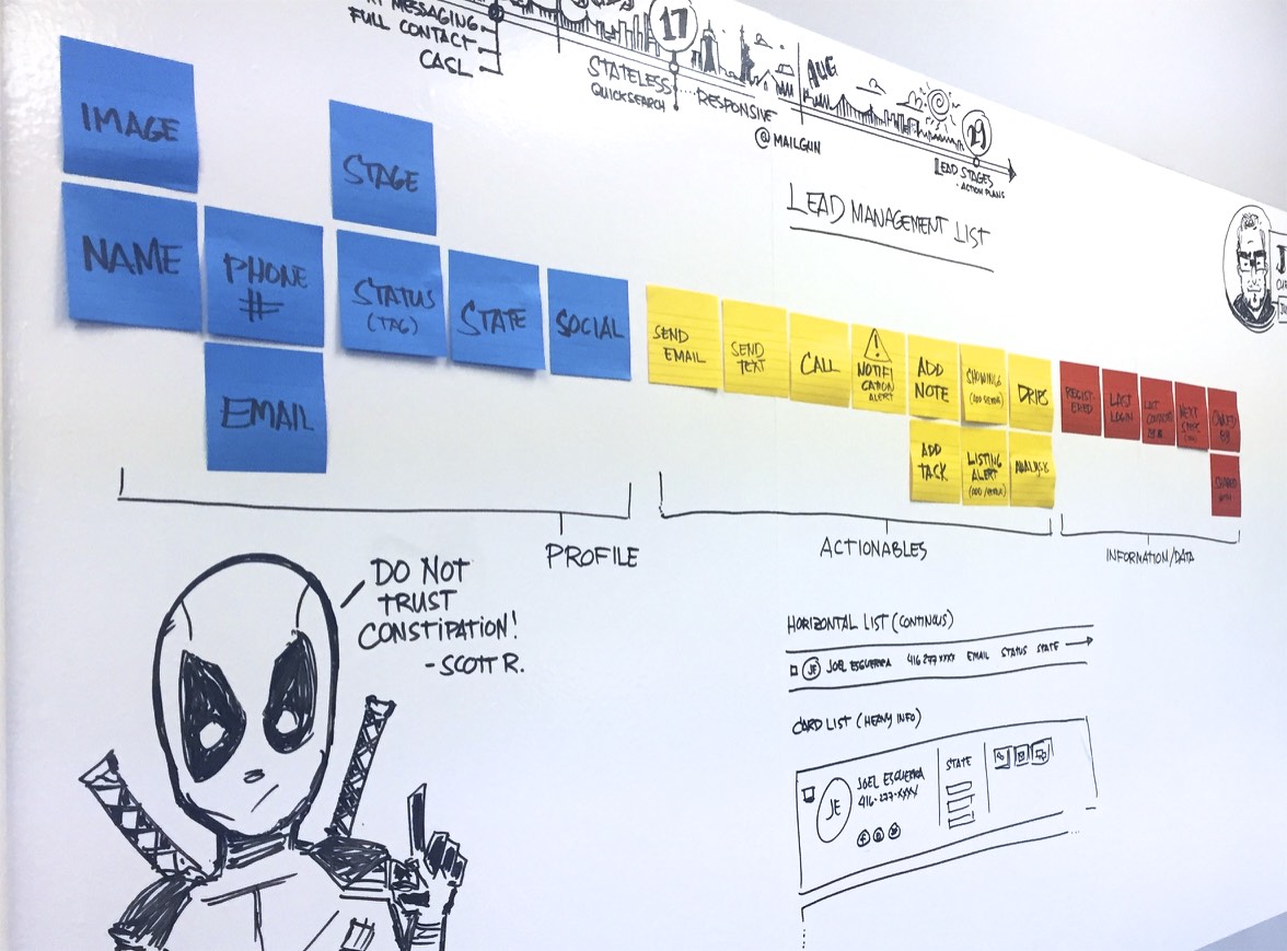
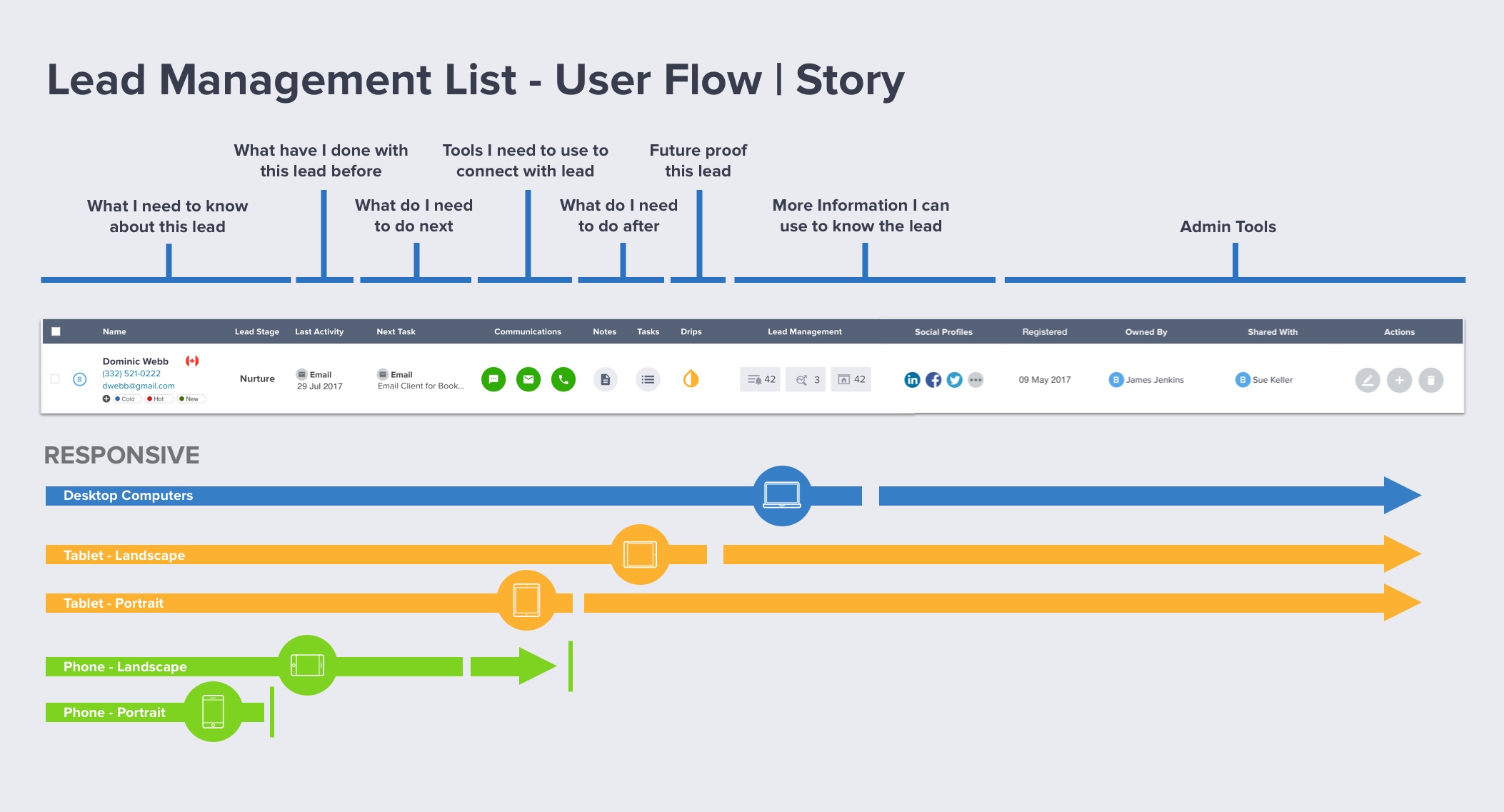
The Lead Management page is where agents live. It needed to answer a deceptively complex question at a glance: Who is this person, what have I done with them, what do I need to do next, and can I do it right now?
The original table attempted to surface dozens of data points with no hierarchy — registration date, last login, last contact, favorites, median home price — laid out as an undifferentiated row of noise. Agents had learned to ignore most of it.

I redesigned it around a user story, not a data schema. The table reads left to right as a narrative:
who they are → what's been done → what's needed → tools to act.
Inline communication icons (email, text, call) sit exactly where the decision to use them gets made.
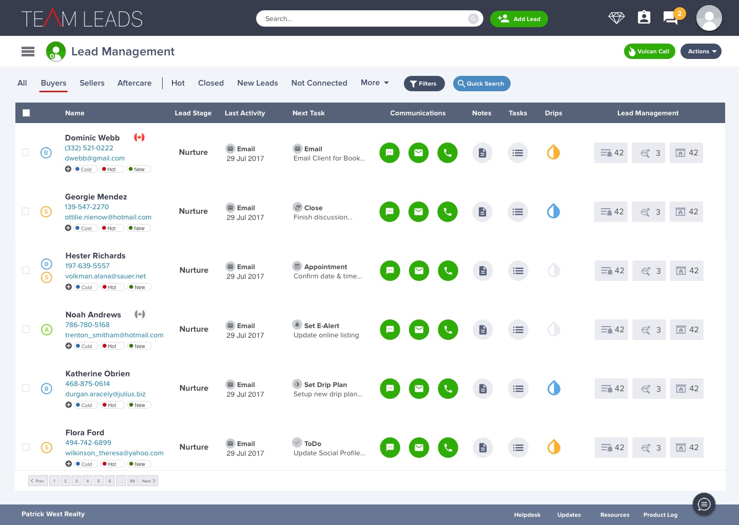
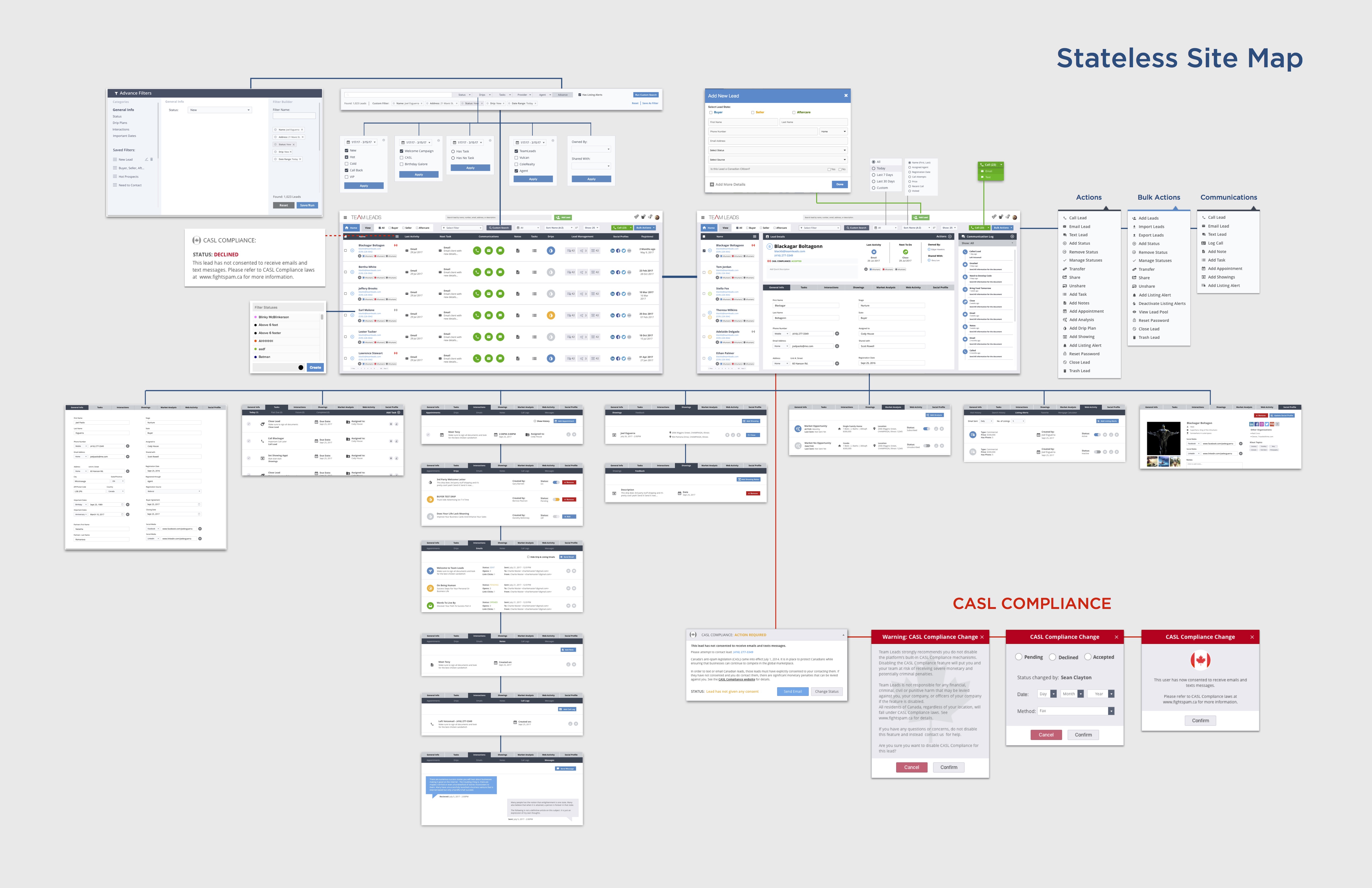
With thousands of leads in the system, the ability to find the right person — instantly — wasn't a nice-to-have. It was the difference between an agent acting on a hot lead in the moment and losing that window entirely. The old platform's search was rigid and slow. We rebuilt it from scratch.

The centrepiece was an autofill Quick Search bar modeled on Google's smart search — surfacing leads by name, phone number, email, address, or even a freeform description in real time. Agents who'd memorized a lead's area or a partial phone number could get there in seconds. No mode-switching required, no separate search page to navigate to.
But Quick Search was only half the problem. Power users — team leads managing hundreds of agents and thousands of leads — needed the ability to slice the database in complex, repeatable ways. That required a full Advanced Filter system.

"The question wasn't just 'find this lead' — it was 'show me every warm lead assigned to Nathan, on a Buyer drip, contacted this week.'"
— Filter System Design Brief


Mobile responsiveness wasn't in the original project scope. But when I sat down with our front-end developer mid-sprint, it became clear the framework we'd built — Material Design components, a structured CSS system, and Webflow Interactions — made it achievable without a parallel track.
I made deliberate choices about what to surface on mobile and what to hide. This wasn't a shrunken desktop — it was a prioritised, context-appropriate view for an agent who's between showings and needs to pull up a lead in 10 seconds.
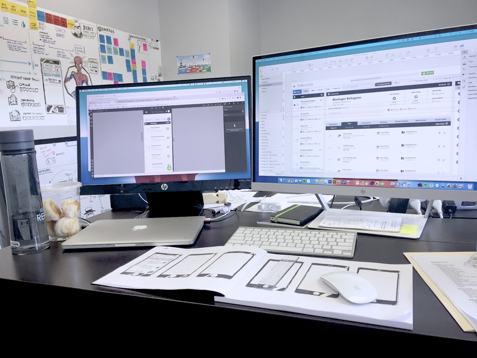
Webflow's Interactions framework let me prototype the complete transition animations and deliver HTML/CSS/JS-ready assets directly to developers — a workflow that compressed implementation time and eliminated the usual design-to-dev translation layer.
"The majority of our users are always on the go. Mobile wasn't a nice-to-have — it was overdue."
— Product Discovery, User Research Phase
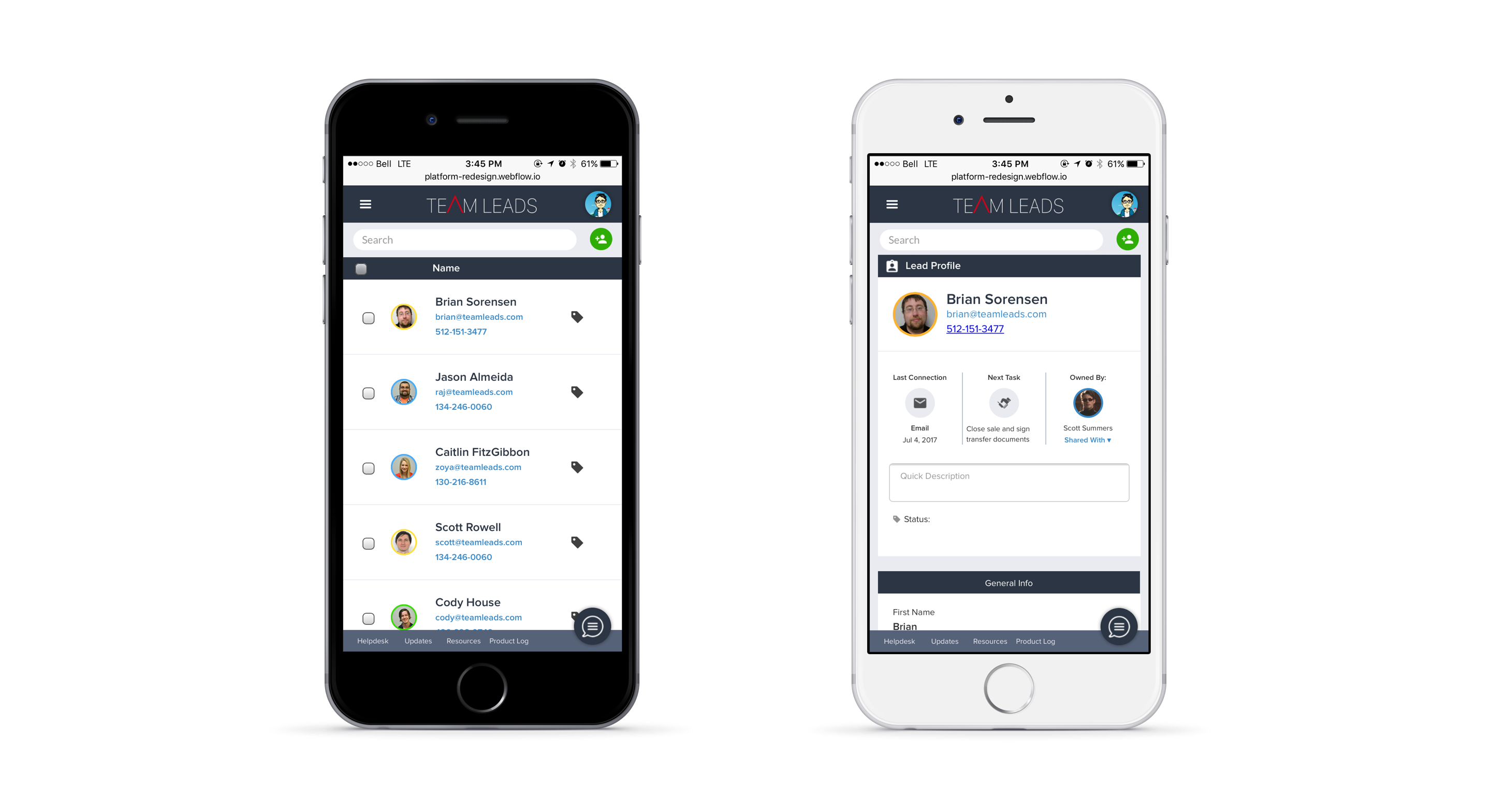
The mobile build focused on: lead list with quick-access communication actions, lead profile with key details, today's task list, and basic search. Anything requiring complex data entry or configuration was intentionally deferred to desktop — respecting the mobile context rather than fighting it.
The redesign shipped in time for Keller Williams' Mega-Camp in September 2017 — a high-stakes product showcase in front of thousands of agents. Here's what the data and feedback showed in the months following launch:

REFLECTION
Coming in with no real estate background could have been a blocker. Treating it as a reason to learn aggressively — reading the agent handbook, sitting with a top broker — meant the eventual designs were grounded in how realtors actually think, not how a designer assumed they did.
Some of the most valuable insights came not from user interviews but from the people fielding tickets and training new agents every day. They had a pattern-recognition built from thousands of interactions that no survey could replicate.
The temptation on a tight timeline is to patch visual issues and ship. "Stateless" required us to rethink the architecture, not just the surface. That was the right call — a reskin of a broken model would still have been broken.
Using Webflow to build working prototypes with real interactions — not static mockups — meant developers received HTML/CSS/JS assets they could actually use. This compressed the design-to-development handoff dramatically and reduced misinterpretation.
Mobile wasn't planned. It became possible because we'd built on a solid, "componentized" system. Good foundations don't just ship the current project — they enable the next one.
.png)