
Joel Paolo
Product Designer
.png)
Lead Product Designer
May - Aug 2021
iOS & Android
Figma, UserTesting, Pendo
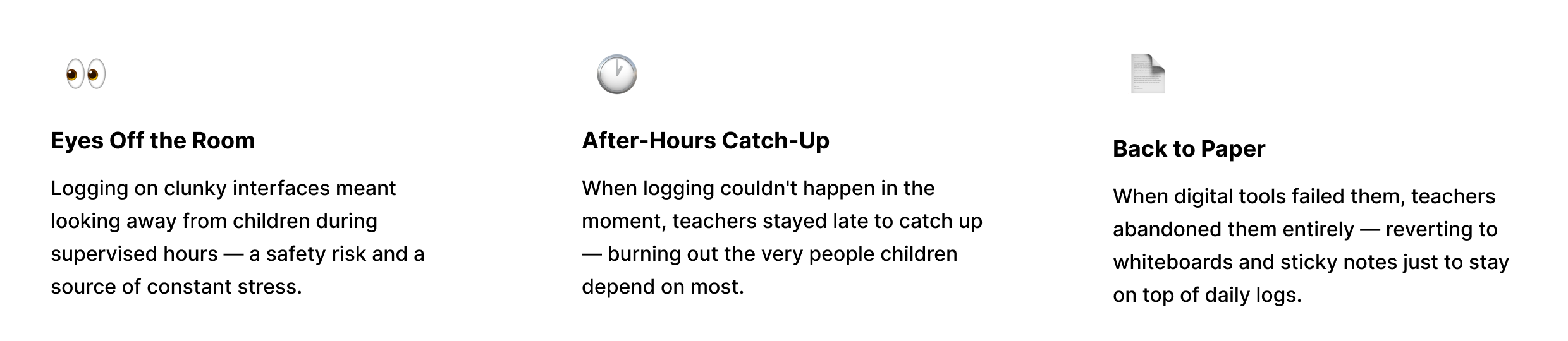
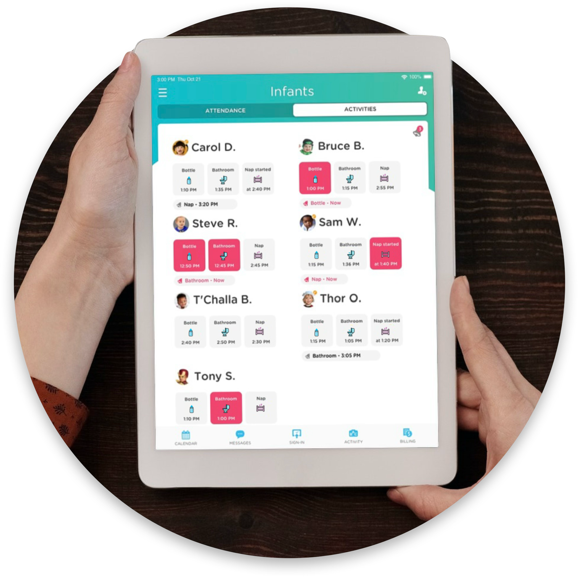
Teachers at childcare centers weren't just logging activities — they were being pulled away from the children they came to care for. Every manual entry meant eyes off the room. Every end-of-shift catch-up meant staying late instead of going home.
This project set out to fix that: a mobile-first system fast enough to use between diaper changes, clear enough that no training is needed, and engaging enough that parents feel present in their child's day — without a single phone call.

Childcare teachers chose their profession because they love working with children — not filling out forms. But existing tools made logging so cumbersome that teachers were either splitting their attention mid-classroom, or staying after hours to complete activity records. Either way, it was time they weren't spending on what they actually came to do.


The interface needed to feel at home in a classroom. Warm, approachable, and engaging — while remaining clear and fast for teachers who can't afford to fumble with technology while supervising children.

We explored two proposed design directions against the current interface, testing different icon aesthetics and grid layouts to find the right balance of visual engagement and usability.
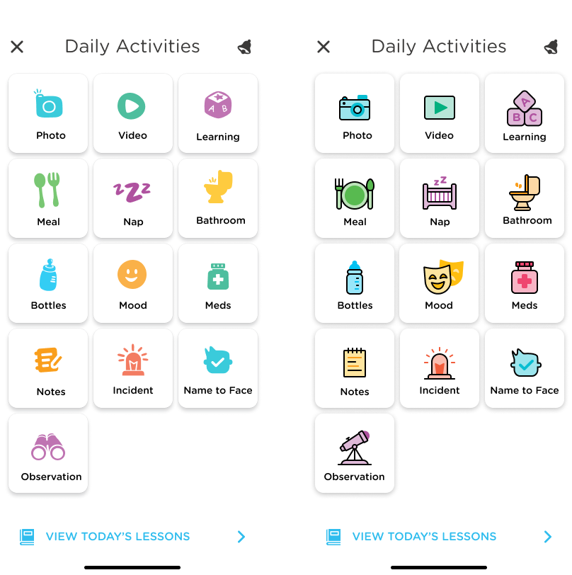
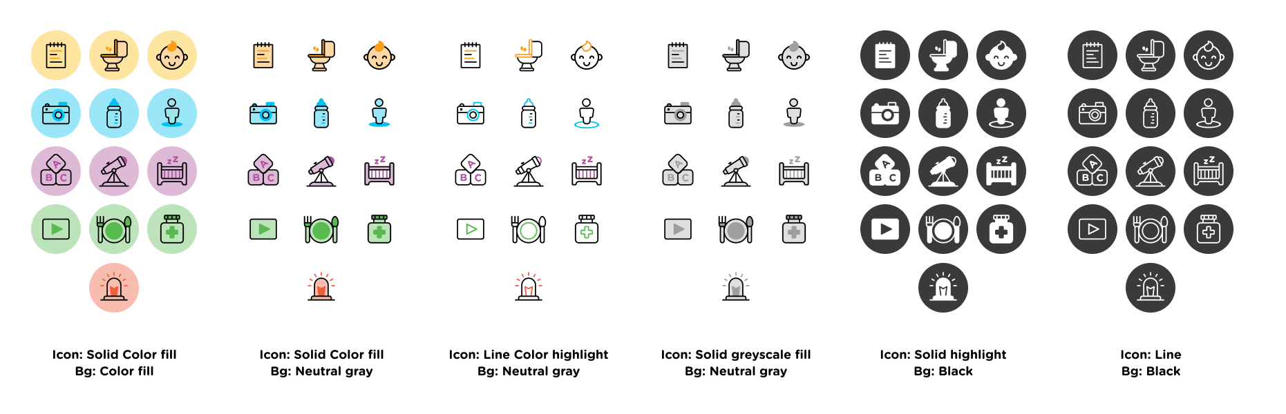
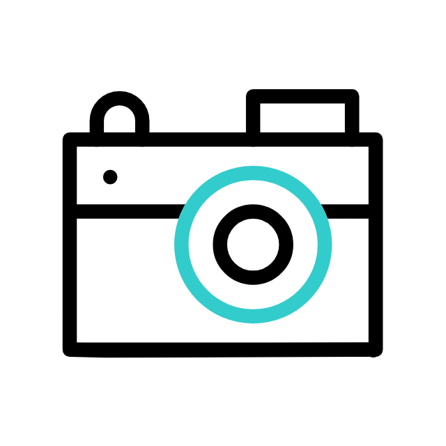
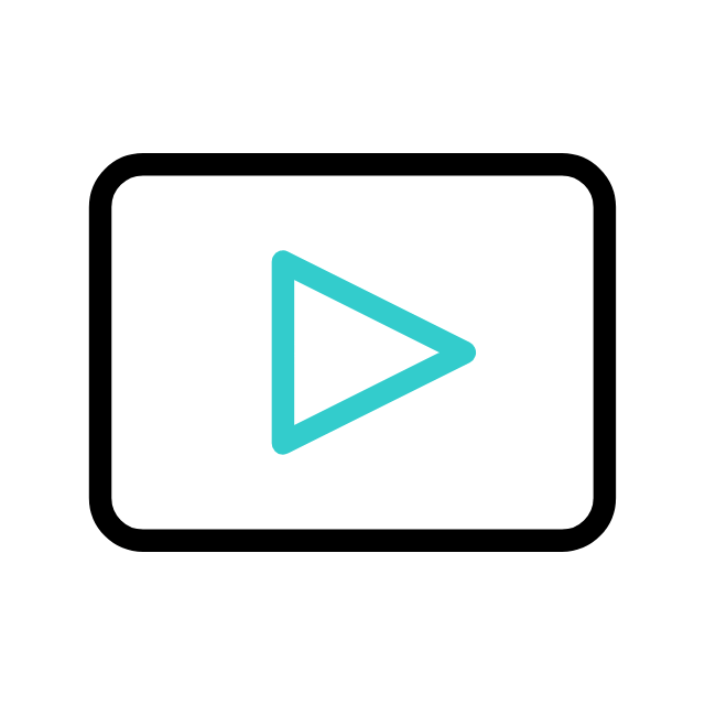
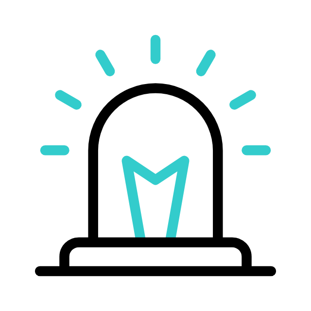
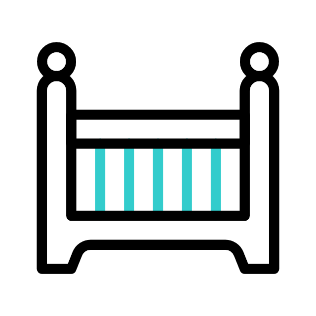
Each icon went through multiple rounds of exploration — balancing recognizability, accessibility, and the warm, illustrated aesthetic that makes the app feel human, not clinical.
Added some interaction animations to each icons to add little more "fun" and the feeling of accomplishment.


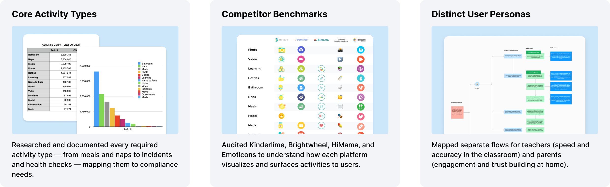
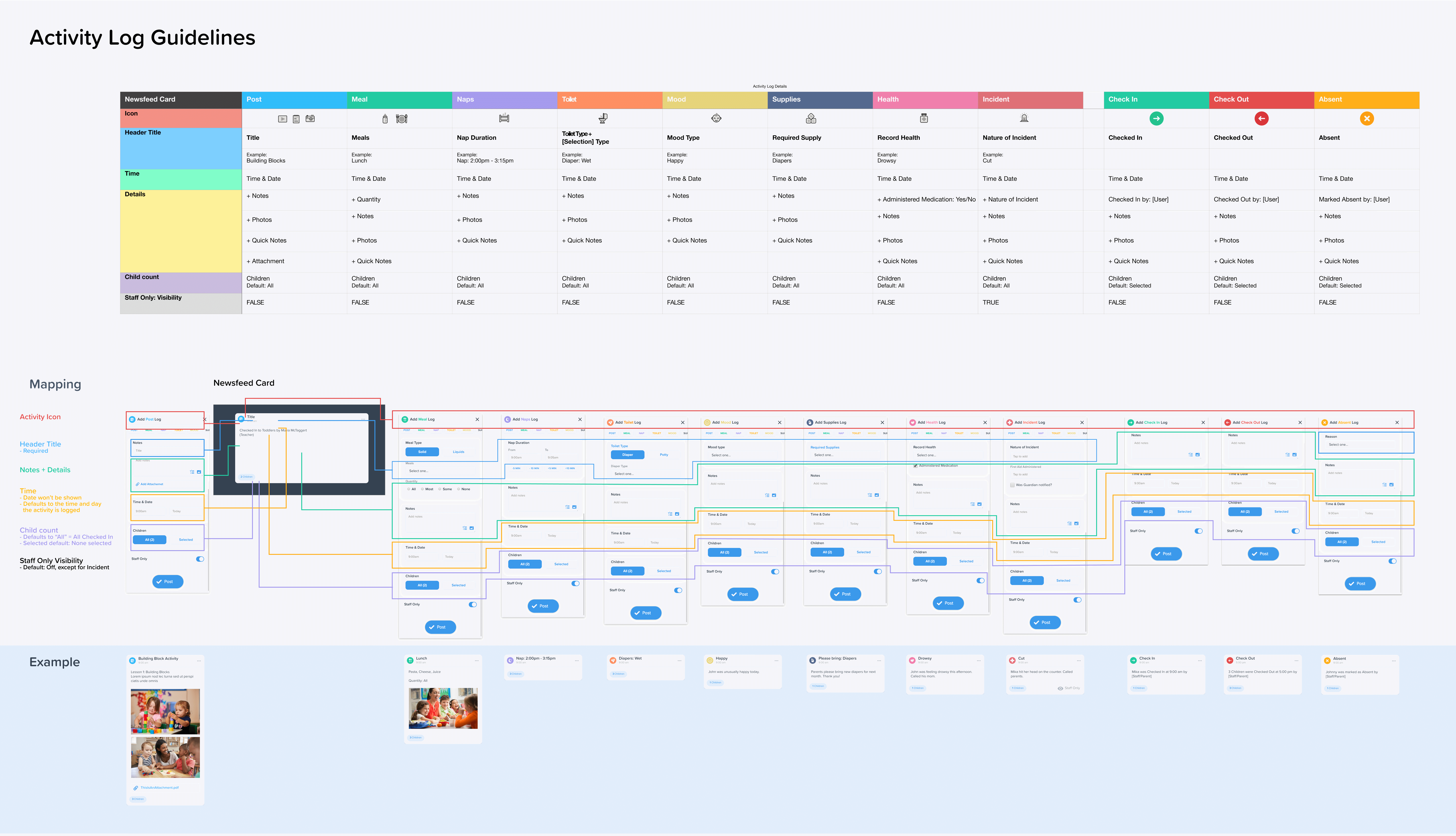
Before a single screen was designed, I mapped out the complete data model for every activity type — what fields are required, what defaults to, who sees what, and how it surfaces in the parent feed.
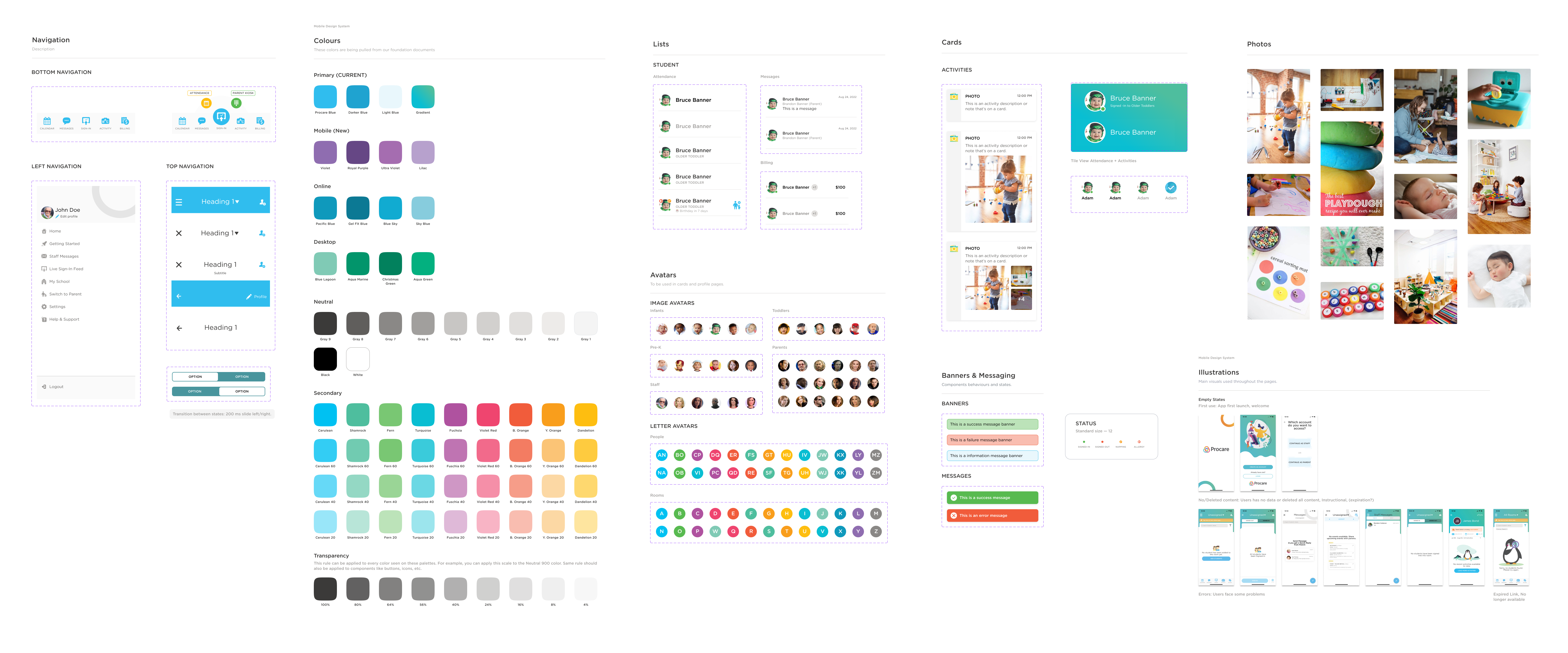
Built from scratch — provided a consistent token system including color, typography, avatars, navigation patterns, and card components that scaled across the entire app.
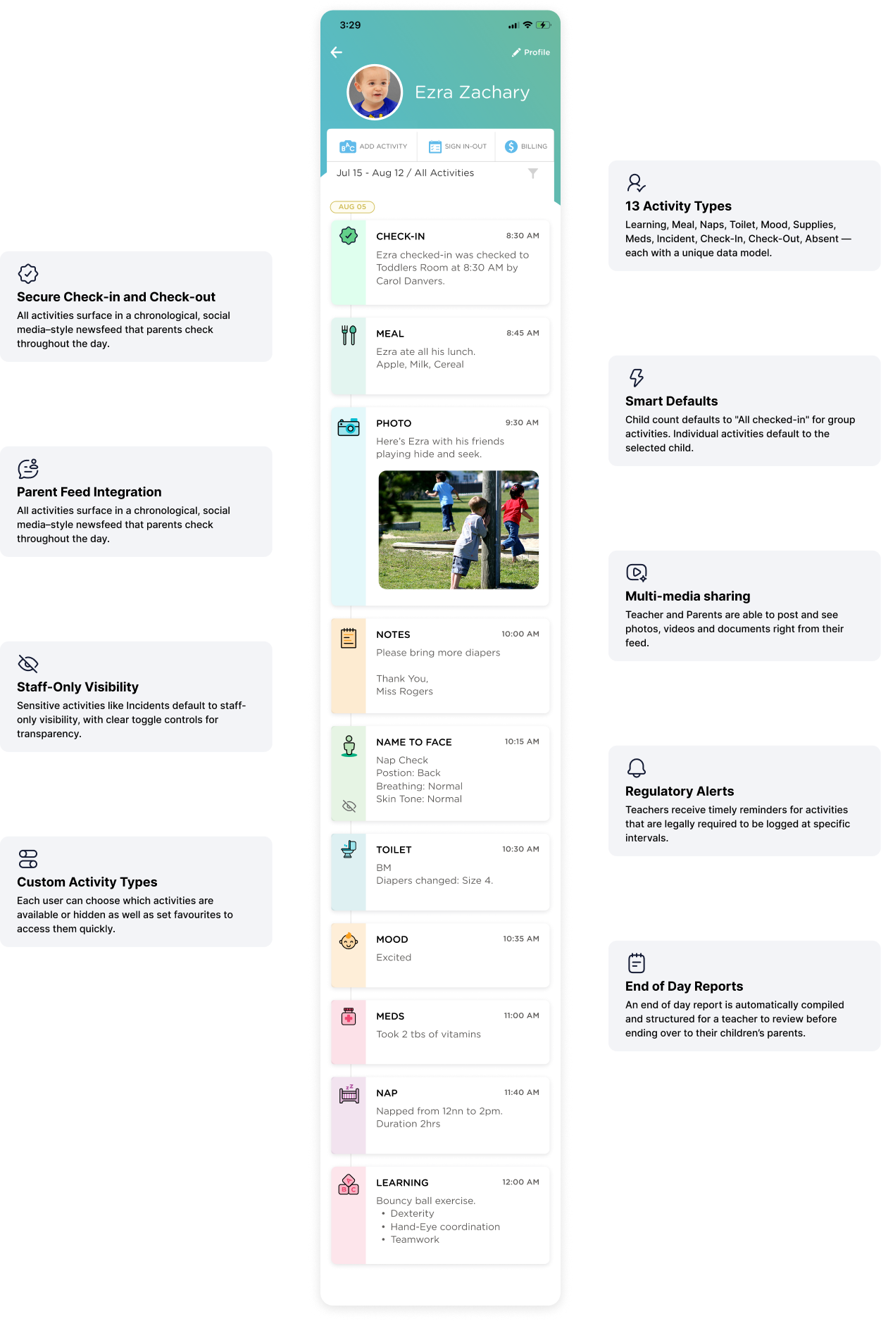
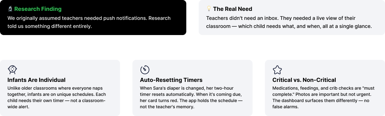
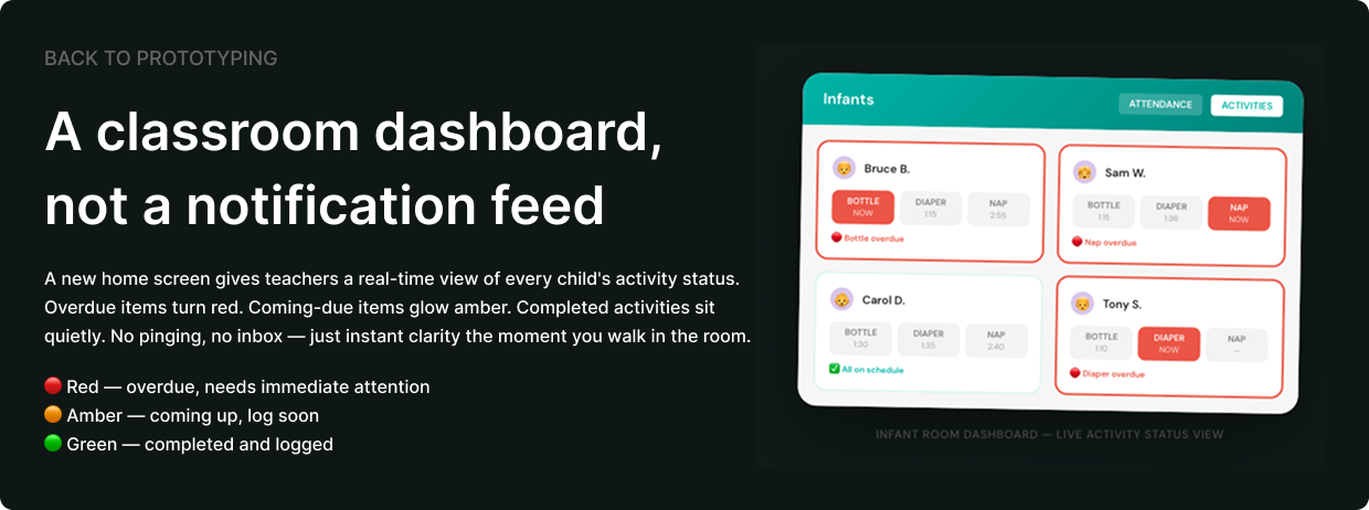
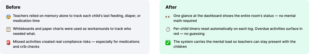
Logging activities was faster — but teachers in infant and toddler classrooms had a new problem. With 6 to 8 babies each on their own feeding and nap schedule, it was nearly impossible to mentally track who was due for a bottle, a diaper change, or a crib check without losing count.
We ran a dedicated Reminders & Alerts research study with childcare directors and teachers to understand exactly what kind of reminders they actually needed — and what we found challenged our original assumptions entirely.
IMPACT
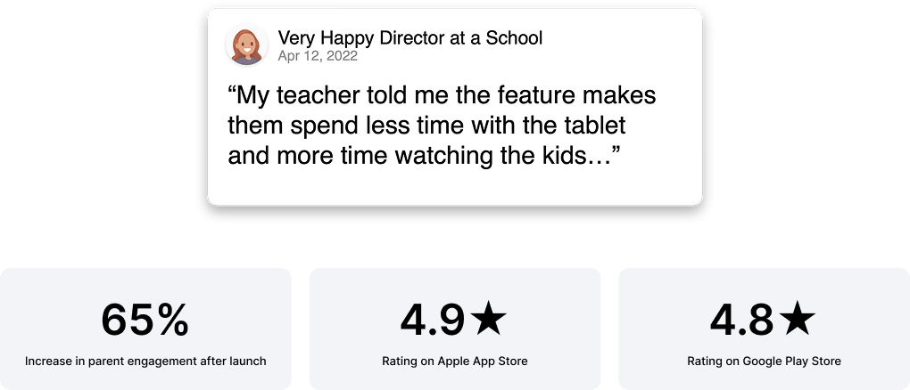
The real measure of success wasn't a metric — it was a teacher who could put the tablet down and get back on the floor with their kids. That's what we designed for. Everything else followed.
A DESIGNER'S REFLECTIONS
A few things I came away with — some expected, some that genuinely changed how I think about designing tools people use in high-stakes, high-distraction environments.
I came in thinking about the app. I left thinking about the room. Teachers aren't using this at a desk with full attention — they're logging a nap while watching six toddlers. That changed everything about how I approached tap targets, flow length, and what "fast enough" actually means. Designing for distraction is a completely different discipline than designing for focus.
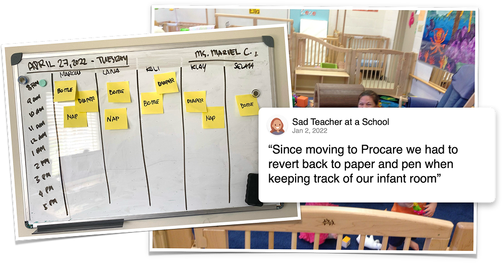
Seeing teachers go back to sticky notes and whiteboards was a hard signal. It wasn't about preference — it was about survival. Paper is fast, forgiving, and requires zero onboarding. That became the bar we had to clear: not "better than the old app," but genuinely easier than a sticky note. That's a humbling benchmark to design against.
I'd always thought of icons as decoration with function. This project unlearned that. Benchmarking across four competitors showed how wildly different the same concept could be represented — and how much familiarity matters when recognition needs to be instant. The goal shifted from designing icons that look good to designing icons that feel obvious. Those aren't the same thing.
Teachers need speed and clarity. Parents need warmth and connection. The temptation is to find a middle ground that half-serves both. The better answer was to design one experience with two distinct lenses — the same data, but surfaced differently depending on who's looking and why. That distinction guided almost every layout and copy decision.
Making the app feel "fun and classroom-appropriate" could have easily been treated as a skin on top of a functional product. But the aesthetic — the playful icons, the warm palette, the social media–style feed — directly affected engagement and adoption. When teachers and parents actually enjoy opening the app, they use it more consistently. Delight isn't decoration. It's retention.
.png)